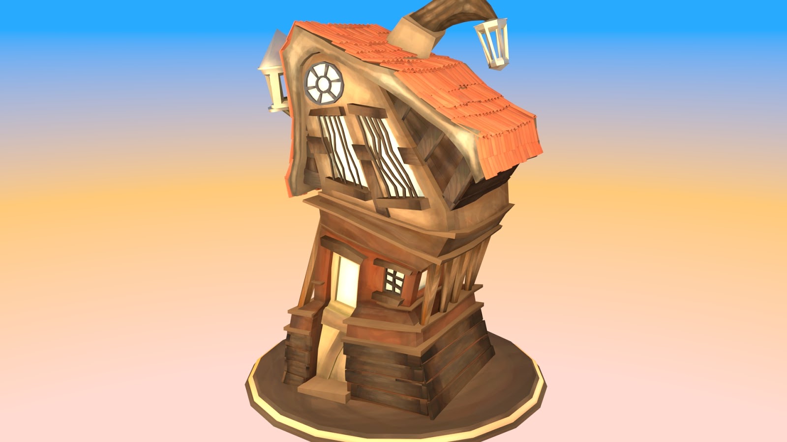
Without yet following the turnaround tutorial, I have made this simple turanround of the building using a basic camera that pans around it. I'm really quite pleased with this, as the lighting works well with the model. I especially like how the shadows and reflections work on the base that the building sits on. I did, however, have to change the quality from HD 1080 to HD 720, as it was taking far too long. I will now go and complete that tutorial.

Showing posts with label Digital Set Pipeline. Show all posts
Showing posts with label Digital Set Pipeline. Show all posts
Wednesday, 27 April 2016

Adaptation B: Fixing the Lighting

Without Colour Management
With Alan's help, I have changed some of the lighting and have also tweaked the ambient occlusion node. It's looking a lot better than before, but I did run into a few little problems when rendering. When I had colour management turned on, it looks a bit washed out and grey, as you can see below, and so I kept colour management off. It is a bit darker and a bit more orange, but is a lot clearer compared to the other render.
I have made a camera that goes round in a circle, which is continuously focusing on the building and so I have left that to render. Once that is complete, I'll move on to trying the Wireframe turanaround tutorial.

With Colour Management
Adaptation B: Improving the Lighting and Main Texture

Maya crashing was a perfect opportunity to tweak the main texture of the building. As you can see, I have added some small details and have changed the colour in the middle of the building, so that it stands out more. Maya crashing did, however, also mean that I had to go throught the Sunset tutorial again, but this team I made a few minor changes that make the light not be as strong.
Adaptation B: Following the Sunset Tutorial

I have now completed the Sunset tutorial and this is much closer to what I had originally wanted. It's still a little too bright, in places, and I feel the shadows could be a little clearer, so I'll need to tweak things without following the tutorial. Overall though, progress is going well and so I'm quite optimistic, at the moment.
As you can see from this image of the back of the building, it is too bright and so I need to fix that.
Adaptation B: Following the Mid-Day Tutorial


I decided to use the exterior lighting tutorials from last year to help me add the lighting. I have followed the mid-day tutorial, with no problems and so now have a well lit scene. I think I will continue onto the sunset tutorial as that is the intended effect/look that I originally intended. Although this mid-day setting doens't look too bad, it is a bit too bright.

Tuesday, 26 April 2016
Adaptation B: Fully Textured

I have now added all the textures to the building, and so now I need to get the lighting all sorted. I'm pleased with how it's going so far, as while each texture was being added it made it look a lot better, which is good, obviously. I think I'll still tweak a few colours in certain areas, however, as I don't think it looks very "Scrooge" at the moment.

Adaptation B: Progress so far

As I've not posted anything for a while now, I thought it would be best to show where I'm currently at. I think it's not looking too bad at the moment, but is looking a little flat, although when I add the lighting and change the render settings it should look a bit better. Obviously there are still some more bits I need to add textures too, and so once they're done, I'll go back and tweak a few colours on existing textures before moving onto the lighting.

Thursday, 21 April 2016
Adaptation B: Making the Textures - Test

Now that I have completed most of the modelling, I have moved onto sorting out the UVs. I have done a quick test on the overall shape of the building, using the UV layout that I have created. The UV layout still looks a little complicated, so that is something that I will need to continue working on.

As I didn't want to spend too much time on this and because I just wanted to see how it would look, I have only used the original colours, that I used in the designs, and have only done the front of the building, with the rest of the building being white.

As you can see from this image, the colours have matched to the model as I had wanted and so now I know that this should work. I will obviously add a lot more detail when it comes to doing the final textures and will also add some "pen style" outlines, so that it will match my illustrative style.
Thursday, 14 April 2016
Adaptation B: Modelling Progress #2

In today's Maya class, Alan helped me fix some problems that I had with my existing modelling, as it was too complex and would be hard to layout UVs for. Through his help, and by adding more of the features to the building, I am at the stage of having the majority of the shapes and large details in place, with just a few things left to do before having a low-res model complete. I'm still quite happy with how it is going, and will hopefully be at the stage of laying out the UVs in the next couple of days.


Monday, 11 April 2016
Adaptation B: Modelling Progress

These two screenshots show my current progress with modelling the building in Maya. As you can see, I have added most of the overall shapes and features of the building, and so only have a few more bits to add - lower floor windows, the features at the back of the building, extra pieces of wood etc. So far, I am pleased with how it is looking and hope to have a low-res model completed within the next couple of days.

Sunday, 10 April 2016
Adaptation B: Started Modelling

I have finally started to model the building in Maya. I haven't done too much, so far, as I have only made the overall shape of the building. It's, obviously, looking a bit strange at the moment, but once I've added the detailed parts and roof to this model, it should look like the original designs.
I am still currently adding colour to the side and back view designs, and hope to have the uploaded as soon as possible.

Monday, 13 July 2015
What If? Metropolis #2 : Wireframe
This is the wireframe image of the city. It is quite a pointless thing, in a sense, as there are to many edges. The reason for this is because I took my silhouette thumbnails and extruded them the same way as the other thumbnails I did. I had to make a lot of edges so I can extrude the right shape. Then I had to make more edges to make it easier to understand when texturing.

What If? Metropolis #2: Lighting tests
Below are a series of light tests that I tried. I tried using different intensities of the ambient light, as well changing the colour to a pale yellow. I chose to do a pale yellow because Hofmann's work in some cases features one colour more than any other. For the textures and the lighting, yellow will feature regularly.


What If? Metropolis : Modelled out scene

The above image shows the city fully modelled. It is very compact and closed in, and there is no "hero building" or unique structure. The reason for this is that in Hofmann's work the main shapes are rather straight forward. It looks a bit like a labyrinth, and I think that works well with the shanty town idea as they too are hard to get around and understand.
What If? Metropolis #2 : "Paint" textures/UVs
Although Hofmann's work contains simple shapes with basic colours, some of his work contains shapes that have a very quick brush stroke of the paint. It is because of this you can see how the colours haven't fully mixed with each other and so you can see several colours in one shape. Because of this, I made some textures using real acrylic paint. I made a lot of different colours that work with the city, but still look like the shapes in his work.


Subscribe to:
Posts (Atom)