Showing posts with label Initial Idea. Show all posts

Tuesday, 4 October 2016

Minor Project: Character Design planning

After my dissertation meeting with Phil yesterday, I asked about my minor project and my new idea. One of the problems that I mentioned was that "as I'll be doing 3, or so, completely different scenes with completely different characters, how will I be able to do this?" A possible way to get round the character problem is by having a character design, that can easily be made into other characters: for example, the lego characters are the same in shape, but each design/paint work is different.

I went back and looked at my info-graphic work and the work of David Shrigley, as that is something that I felt confident doing and was able to create a good, little character. As this is 3D, however, the challenge with having my info-graphic character and Shrigley's work as influences is that they are 2D, and so may not translate quite as well. I've gone through many quick drawings over the past couple of days and have designed these characters.


As you can see, they are all mainly the same - hair style being the main difference. This page shows that it is possible to have one character design, that is then made into several characters. I like these drawings, although as I'm also considering doing the 2D facial rig on a 3D character, I'm not too sure how that'd look.

Tuesday, 16 August 2016

Year 3 Project: Initial Idea development

I have been thinking a lot about what I want to do for the first project of year 3, and have gone through many different ideas, of various genres - ranging from creating something that centres around race, gender or sexual orientation, then to something quite dark and ambiguous. I have been thinking about what my strengths are and what genre best suits me, as well as looking at my past work. It is very clear to me, in my opinion, that my info-graphic has been my best final piece of work yet. It was something I enjoyed making and is something that other people seemed to enjoy - which is what I was really happy about. I, therefore, feel that the comedy genre may be the most suitable genre choice.

I am not a fan of stand-up comedy, but one such comedian who always makes me laugh is Rowan Atkinson. I've been watching a lot of his sketches/clips of him online, whether it's from The Thin Blue Line, Rowan Atkinson Live and, of course, Mr Bean. He seems to create comedy in the simplest of ways and gets the audience to laugh just through his movement and facial expressions. One such sketch from his Live show is where he plays the "Invisible Drums". What stands out to me is that it's so memorable and enjoyable, even without dialogue - It acts as a silent film. I could expand on this by having it act as a call back to the era of black and white silent films, starring the likes of Charlie Chaplin and Buster Keaton, who we learned about last year.


I have not yet modelled a character, or even animated one, to a reasonable standard, and so this is a challenge I would like, and need, to take on. I want to create something that everyone will enjoy, but will demonstrate a clear style, which then combines with my "light meets dark" style of comedy, which worked well in my info-graphic.

Rowan Atkinson Live - Star of Mr.Bean - Funny Invisible Drum (2010) - https://www.youtube.com/watch?v=A_kloG2Z7tU - (Accessed 16/08/2016)

Tuesday, 5 April 2016

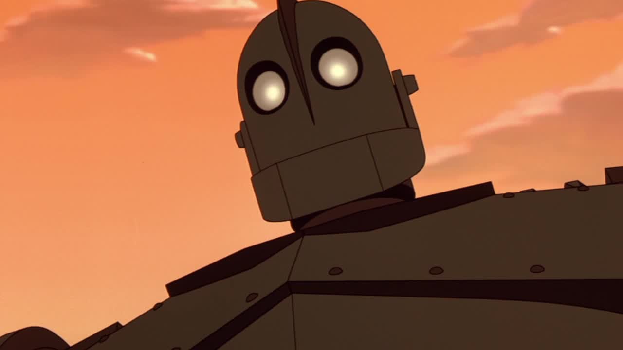
Sculpting: Character Choice

 
For the sculpting sessions, I have decided to model The Iron Giant. I don't think sculpting will be one of my strengths and so I want something quite simple, but is something I'd still quite like to have. As I wanted to do a character from a film/TV program that I like, I had to think of something that I thought I could actually make. At first I was looking at characters from "A Nightmare before Christmas" and "Corpse Bride", but they were all too complicated for me or too simple, so that is why Iron Giant is a good choice for me.
 

Monday, 18 January 2016

Adaptation A: Initial Character Designs


I have done these drawings of the character that will be in the info-graphic. As I will be doing it in Flash and will be drawing it out quite often, I want something simple, and a design that works with the idea that it will be on a whiteboard (Although drawn/animated in Flash). I tried to do them as fast as possible, and so it only took about 10 seconds to do each one. I wanted to do as many expressions as possible to demonstrate what he'll look like in many situations. Some of them work better than others, of course. I think the ones that work best are where he's running,as the standing still ones don't have as much emotion in them.

The character, himself, will be very fast and crazy, all the while being quite stupid. I think these drawings work quite well, as a result.

Sunday, 17 January 2016

Adaptation B: Design Style - Initial Idea


I have created this design to give an idea of the intended style. I chose one of the shops that I mentioned in the previous post - Waterstones. While doing this I noticed that I was choosing quite bright colours, and so that gave me the idea that it could be set by the Seaside, which would allow me to use bright colours for the other buildings. I haven't tried to incorporate any personality or any paticular style into the drawing - this is just to show an example behind the overall style.

Friday, 15 January 2016

@Alan - Adaptation B: Tutorial Feedback + New Idea

In today's tutorial, Alan highlighted that my initial ideas for the adaptation animation were too basic and didn't go deep enough into the points that they were trying to tell, which is something I thought myself. Through some examples of other students' work on this project, I have tried to think of other things that can be adapted. On my way home on the bus, as it went past the Rochester high street, I thought about the idea of making an animation that shows the buildings of a high street interacting with each other.

My thought was that the camera could show a row of different shops, where the buildings are made to look like a face. Depending on the shop, the appearance and personality will differ. For Example:
  • Ye Olde Sweet Shop: Old, Victorian time period style design. - Like an old Woman. Polite, confused.
  • Waterstones: Neat, Classic design.  - Well spoken/Mannered, Polite, Clever. Arrogant.
  •  Primark: Modern, slightly run down. Not very intelligent. Agrees with everyone else.
  • Games Workshop: Modern. Nerdy. Nasal sounding voice. Quite intelligent.
  • Woolworths - Shut down. Flowers laid outside it. Windows smashed.
  • Costa Coffee - Polite. Quite smart. Friendly.
These are just some examples I thought of. This idea could lead to quite a funny animation as some of the shops are completely different to one another and could create some kind of conflict. To avoid, having people walking past/into these shops, the animation could be set before they open, and they have just woken up.

Saturday, 9 January 2016

Adaptation A: Crit Feedback


Going into yesterday's feedback I thought that "A Beginner's guide to Cookery" was my favourte idea, but upon telling everyone my idea and getting the feedback, I realised it wasn't plausible. It was agreed that "A Beginner's guide to Failure" was the best of the 10 final ideas.

Once the crit finished, I was thinking about ways as to how I could make it quite funny and entertaining to watch. My initial idea is to have it where it actually encourages you to fail and acts as if that's the right thing to do. I thought of possible pieces of dialogue, such as: "Are you tired of success? You, are? Good!" and " You learn more from failing than you do from success, so what's the point in succeeding?". This will make infographic very strange and unusual, which would lead to the humor.

I have done some bits of research on the internet, and have looked at things that are recommended if you want to succeed. I could, as a result, reverse these suggestions so that they fit into the guide to failure. The reversed steps are below:

1. Don't have a Plan B.

2. Keep doing the same thing.

3. If at first you don't succeed, give up.

4. Be/Appear sloppy.

5. Don't search for assistance.

6. Don't respond/listen to feedback.

There are many more, but these are simple and basic things that could be referred to in the guide. The challenge, with this, however, is to avoid it from sounding like step after step and not like a guide.


Thursday, 19 November 2015

Character: Initial Design Idea - Retinue


I have made this design of a character from the Retinue territory and it shows my initial thought behind how they'll look. I have also made an emblem for this territory as they will all their own. 

Retinue Definition: a group of advisers, assistants, or others accompanying an important person.

From the defintion, I have designed a character that resembles a Knight, the obvious reason being is that the character serves a person of importance, like a King or Queen. When designing the emblem, I looked at emblem meanings and so found the meanings of the 3 different icons in the emblem that I designed:

Key: The key is a symbol of knowledge, guardianship and dominiontwo key cross is the symbol of St. Peter, the key to the gates of heaven.

Sword: The sword is the symbol of the military honorIt is also a symbol of power and freedom. The sword (especially with flameis also a symbol of purification.

Tower: The tower is very much like a castle,  it is a emblem of grandeur and of society.It is also a symbol of the defense and an individual fortitude.

I felt that these definitions suited the territory well and so when designing my character I tried to make it suit those meanings and colours. Overall, I think it's quite a good starting point, but there are some things that need fixing, like the colours, the face and the clothing.

Bibliography:
(2015) - Heraldry Symbols and their meanings - http://www.familytreesandcrests.com/heraldry-symbols.htm - (Accessed 19/11/2015)

Wednesday, 23 September 2015

Character Project: Initial Idea

Since yesterday, I have been thinking about how I could create a game using the three components of Urban, Resources and Air. Following on from Kayliegh's response to my post yesterday, I have been thinking about the idea of having two teams: The Foxes and the Raccoons. They are both regarded as pests and can live around Urban areas, and they're known to go through people's rubbish and gardens. This could be their way of collecting resources in order to provide for their own kind/family. Air seems like a tricky thing to include in a game. I then started to think about the idea of if it could be used as a sort of time limit, where both teams have to collect as many resources as possible before they all get blown away in a hurricane or storm, for example. This is a very early idea and so it doesn't make a lot of sense, but I can't think of a game like it, so it would be quite a unique idea.

Wednesday, 10 June 2015

What If? Metropolis #2: Influence Map - Hans Hoffman + Initial thoughts + Fantastic Voyage UPDATE


This is an influence map showing some of Hans Hofmann's work. As you can see it is very abstract and so creates some interesting shapes. With regards to designing the city, my initial thoughts are that it should be very colourful and quite obscure. In some of these pictures, I can see layouts of a city, replacing blocks with buildings of the same colour and using  colours for the sky/sea/background etc. In comparison to both Bridget Riley's work and the city I designed,  I imagine this one to be more vivid and more "crazy" - if that's the right word. I think my biggest challenge will be managing to convert the rather basic shapes and colours of his work into a city.

Fantastic Voyage UPDATE:
I have been working in flash for a couple of weeks or so now, and have been doing so while having a wealth of internet problems. I intended to have it finished by the end of this week, but it will probably be next week.

Tuesday, 24 February 2015

Fantastic Voyage: Initial Ideas

After today's brief and watching the Bio-scientific scenarios, I have come up with a couple of ideas for the animation:

Malaria:
It begins with a POV shot of a mosquito in a LEDC in Africa. We see an establishing shot of said area, before the mosquito lies through a window. We see a young boy asleep, as the mosquito lands on his arm, where it then begins to bite him. The camera shows the sporozites enter the boy's blood stream. The camera then follows the sporozites as it carries out the life cycle. Eventually, we see the gametocytes leave the boy as another mosquito is biting the boy. We see how the cycle has affected the boy's health, as the other mosquito flies away.

This is quite a depressing idea, as wee how the boy has becoming severely unwell. This idea is obviously not suitable for younger generations, and would be more suitable for teenagers.

Hookworm:
I've not thought of this idea in the same way as the Malaria idea, but it would be for young children. A friendly, happy bacteria comes onto screen. He has a happy/funny voice, introduces himself before a nasty, evil looking hook worm comes into the picture. The bacteria warns us about it and then the worm replies with a snake-like voice. The worm leaves. The bacteria then describes the life cycle. By the end of the cycle, we see the same hook worm come into the picture and asks what he was talking about. The bacteria acts confused. The worm looks suspicious. The camera then shows the bacteria winking at us.

This is quite a nice setup, although hook worms and their cycle are quite scary and so maybe a bit terrifying for the children.

Slime Mold:
A young boy scout is on his bike in a forest. He stops and looks at all his badges, he opens a book and we see that the only badge he has left to get is the Nature badge. He closes the book, looks round and goes to a tree, where he notices something. He takes a magnifying glass out of his bag and looks at the bark of the tree. The camera moves through the magnifying glass, and we then see the slime mold cycle. The cycle ends. The camera zooms out from the magnifying glass and we see the boy smile. He then pulls out a notebook takes a few notes and then gets on his bike and rides out.

I quite like this idea and would be suitable for Primary School students. It can be quite colourful and friendly and would be very detailed. It may go over the 1 minute time length, however.

Friday, 13 February 2015

From Script to Screen: Allotment - Interior


This is a reasonably quick drawing of the interior of the Shack that Simon Frost lives in. I did this in my sketchbook, and I tried to include as much of the detail from the script as possible. I actually quite like it. It look small and confined, and so could provide some tense scenes. It demonstrates that it is deteriorating/old and it works well with Simon Frost's character. I will continue to experiment with the setting, once the character designed are finished.

Friday, 23 January 2015

From Script to Screen: New Idea


As my first idea, that I continued to work on, wasn't working very well and had several issues, with regards to the back story, use of the 3 components and the relationships between the characters, I understand that the best option is to move onto a new idea. 

I have been thinking about a different approach and have come up with another idea. (I haven't thought about it too much, just about what one of the scenes may be)

Idea 1: In a gardening shop, there is one last wheelbarrow. A woman is looking at it and considering buying it, a man comes over, politely talks to her, helps her pick it up and move it to the check out. We then see the woman pushing the wheelbarrow outside, and then suddenly someone grabs her and pulls her into a photo-booth. The camera focuses on the booths curtains shaking, then they stop. A man then walks out and then the camera moves to the floor and we see blood pouring out of the booth and underneath the wheelbarrow. 

Hopefully, I can think of more ideas, that have a much easier to understand story behind them.