Wednesday, 22 July 2015
Personal work: Jared Leto's Joker from Suicide Squad
Now that I have finished off the re-submission of the What If? Metropolis project and have completed the Fantastic Voyage animation, I'm going to keep myself busy by continuing to practice my drawing skills both on paper or digitally.
I have started a few, but the first one that I have finished is a pen drawing of Jared Leto's interpretation of the Joker from "Suicide Squad" (2016). In life drawing last year, I developed a line art style using pen and wanted to improve on that. The Joker doesn't have much colour but I tried to make the greens/purples/reds stand out. It took a fair amount of time to complete this, but I am really rather pleased with it as it is recognisable and there are no glaring mistakes.
Monday, 13 July 2015
What If? Metropolis #2 : Final Render
This is the final render of the city. It is very colourful and crammed together, so in that regard it matches the thumbnails and Hofmann's work. However, it could be argued that it's just a series of colourful shapes packed together, with little detail. Perhaps I should have made the buildings look like generic sky-scrapers and more like small buildings.
What If? Metropolis #2 :Concept Piece #2
This is another concept piece that I did. It is at a lower angle so you can see more of the city. Due to it being so compact, you can't see the roads and how each building is connected.
What If? Metropolis #2 : Concept Piece #1
Using the silhouette thumbnails, I put them into layers and put them together. I then drew over the it, made it a bit neater and added the colours. I tried to make it look a bit 3D as wells as trying to replicate Hofmann's work. Although his work doesn't have any outlines, especially ones that are as thick as the ones in this picture. This will be a view from above.
What If? Metropolis #2 : UV Layout
This image shows the UV layout of each building in the city. Like the wireframe image, it is very confusing to look at and makes little sense, but it did help when texturing.
What If? Metropolis #2 : Wireframe
This is the wireframe image of the city. It is quite a pointless thing, in a sense, as there are to many edges. The reason for this is because I took my silhouette thumbnails and extruded them the same way as the other thumbnails I did. I had to make a lot of edges so I can extrude the right shape. Then I had to make more edges to make it easier to understand when texturing.
What If? Metropolis #2: Lighting tests
Below are a series of light tests that I tried. I tried using different intensities of the ambient light, as well changing the colour to a pale yellow. I chose to do a pale yellow because Hofmann's work in some cases features one colour more than any other. For the textures and the lighting, yellow will feature regularly.
What If? Metropolis : Modelled out scene
The above image shows the city fully modelled. It is very compact and closed in, and there is no "hero building" or unique structure. The reason for this is that in Hofmann's work the main shapes are rather straight forward. It looks a bit like a labyrinth, and I think that works well with the shanty town idea as they too are hard to get around and understand.
What If? Metropolis #2 : "Paint" textures/UVs
Although Hofmann's work contains simple shapes with basic colours, some of his work contains shapes that have a very quick brush stroke of the paint. It is because of this you can see how the colours haven't fully mixed with each other and so you can see several colours in one shape. Because of this, I made some textures using real acrylic paint. I made a lot of different colours that work with the city, but still look like the shapes in his work.
Sunday, 12 July 2015
What If? Metropolis #2: Extruding Hofmann's work in Maya
These are some of the images that I chose and took into Maya, so that I can extrude some of the shapes from Hofmann's work. It gave some very interesting results, some of which look like a city. They are quite compact in some cases, and so they work well with his style. I have taken what I have learned from making these into making the final city.
What If? Metropolis #2: Silhouette thumbnails 1-26
Below are the silhouette thumbnails that I did very early on. At the time of making these I was unsure about how the city would look and be made etc. so I wanted to see what shapes I could get from Hofmann's work. I did get some very interesting results, some of which made it easier when I was extruding images in Maya, which I will upload a little later.
Fantastic Voyage: Final Animation + Art Of
Stamp of Nature from Daniel Reason on Vimeo.
This is the final submission post for the Fantastic Voyage project. I have had many problems along the way so it too longer than I thought. It looks very rushed and fast in places, so that is something I need to work on/improve. When choosing the music, I wanted to get the 1950s' but I also took into the consideration that the animation is a bit fast. The music is up-beat and I think it works quite well with the animation. Because of this, when I was making it and thought certain sections looked a bit rushed, the music made it quite funny and it didn't seem so bad.
Saturday, 11 July 2015
Fantastic Voyage: Writing in the book
Here is another section from the animation. This section is very important as it is the part that explains each stage of the life cycle. It works quite well. Maybe a bit too fast and weird the hand/pencil only moves in a straight line, but I like how it looks. In the final animation it will be cut between the life cycle itself, so these little issues won't be too bad.
Friday, 10 July 2015
What If? Metropolis #2 : Final idea
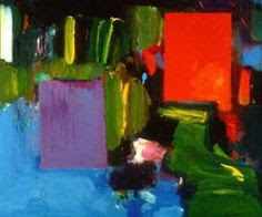
Whilst I'm waiting for things to load/save in the Fantastic Voyage animation, I wanted to do a quick post just to give a little idea of the city. I will still be making the shanty town and compact/crowded city that I have talked about before, but I will incorporate certain features from several pieces of Hofmann's work. For example, from fig.1 the light blue area will be made into a river. Fig.2 has that stair-like shape, so there will be crooked stairs around the city as a way of getting around it. And from fig.3 there will be tall adjacent buildings that will have a similar shape to the ones in that piece.
Fig. 1
Fig. 2
Fig. 3
Friday, 3 July 2015
Fantastic Voyage: Scene 2 + WI?M UPDATE
Having just realised that I haven't posted anything for a while, I thought I'd post this to show how it's going. Although this is just the one shot, I have done other shots from the animation but haven't completed them all and put them together. I have had to do other things so I have had to delay completing the animation once again.
I have also been completing the What If? Metropolis re-sit and have been working on thumbnails. I have done some silhouettes using the shapes from Hofmann's work, which don't work too well. I have re-created more compositions in his style, and have taken some of his work into Maya and have extruded the shapes, which have given some interesting results. I will post these in the coming days.
Subscribe to:
Comments (Atom)


