Tuesday 24 November 2015

Character Session: 24/11/2015

In our final character session, we were put into groups of three and we had to design characters and environment for this game, which I can't yet remember the name of - I was in a group with Charlie and Vlad, and we decided on which characters and environment we would each design through picking numbers, and so I had to design LX-Er, Dr Kromar' Zun and The Fallen Angel.

They each had their own description and so we had to design them based off our interpretations. For the the Fallen Angel ship (Exterior), I want to make it quite simple, with regards to the shape, but have a complicated look through the amount of things attached to it. The reason behind this is that the description said that the ship had a sleek design, but had been heavily modified. The description also mentioned but it had been damaged as a result of some of the weaponry being removed/stolen. I tried to show this by cracks and splits in the metal of the ship, and with planks covering them. I also had to design the floor plan, i.e. how the rooms are organised. I kept this quite simple and straight forward as I thought it would be best to avoid obscurity. I then designed a treatment room for one of the characters that I had to design. I'm rather quite pleased with these designs as they are all quite well detailed and work reasonably well with the descriptions that I was given.

The two characters that I had to design were LX -ER, which is a medic drone, and Dr Kromar Zun, which is an evil, Venusian doctor and diplomat that experiments on people. For LX - ER, I wanted him to look very equipped by having pockets with medical supplies in. I also added the first aid symbol to further highlight his role. Later on in the session, Justin mention that the character needed to be able to fly. At this stage, I had already finished the design, so I ended up just adding robotic wings, but they appear in the design as a jet pack. When designing Dr Kromar' Zun, I wanted to show his evil side by basing his face on the Devil. I then designed the rest of him based on his role as a Dr and that he experiments on people. I think LX - ER is a more successful design than Dr Kromar' Zun as it matches the description to higher degree, where as the Dr Kromar' Zun design misses out on some details like being Venusian.

The Fallen Angel Ship 

The Fallen Angel - Floor Plan

LX - ER Treatment Room

LX-ER

Dr Kromar'Zun

Adaptation: Film Review - Carrie (2013)

Fig. 1 Carrie (2013) Movie Poster

Kimberly Peirce's Carrie (2013) is the second film adaption of Stephen King's novel of the same name. This modern take on it's source material demonstrates Hollywood's lack of ideas and takes one it's most memorable and well regarded horror films, from 1976, into the 21st century cinema.

Fig. 2 Carrie (Played by Chloe Grace Moretz)

Chloe Grace Moretz plays Carrie in this film and so this is a much different choice of actress in comparison to the 1976 version, where Sissy Spacek played the lead role. She is an attractive actress and so her "weirdness" and obscurity is in her actions and how she speaks and dresses. Because of her appearance, though, it feels a little strange that she is segregated from everyone at her school and doesn't have anyone to protect her or talk to her. Despite this, it is clear that all is not as it seems with Carrie. It becomes clear in the film that her extremely religious Mother (Played by Julianne Moore) controls her and forces her to do what she wants. This consequently means that Carrie has to live with being abused, both mentally and physically, at home and at school.

Fig.3 Getting ready for the Prom

Effectively, this version is played out rather similar to the 1976 version, however as it is set in current times, the characters wear modern clothes and own modern things, such as iPhones. The famous locker room scene from the 1976 film is re-imagined through the other school students filming Carrie on their phones. This makes for a very sympathetic scene and highlights just how cruel the students can be. 


Fig.4 Carrie covered in Pig's blood

In conclusion, this is a very modern take on Stephen King's classic. It demonstrates the change between 1976 and 2013, this therefore highlights the difference in the challenges that Carrie faces in the two films. Although the overall plot structure is the same as the original version, it doesn't feel as convincing, however, due to the fact the wrong choice of actress (Chloe Grace Moretz) and the strange CG effects used in the final stages of the film.


Illustration List:
Fig. 1 Carrie (2013) Movie Poster - http://www.destroythebrain.com/wp-content/uploads/2013/10/carrie-domestic-poster.jpg - (Accessed 17/11/2015)

Fig. 2 Carrie (Played by Chloe Grace Moretz) - http://projectdeadpost.com/wp-content/uploads/2014/04/Carrie2.jpg - (Accessed 17/11/2015)

Fig.3 Getting ready for the Prom - https://c.o0bg.com/rf/image_460w/Boston/2011-2020/2013/10/10/BostonGlobe.com/ReceivedContent/Images/CARRIE-5693.jpg - (Accessed 17/11/2015)

Fig.4 Carrie covered in Pig's blood - https://i.ytimg.com/vi/7kYDXkO304o/maxresdefault.jpg - (Accessed 17/11/2015)


Thursday 19 November 2015

Character Session: 19/11/2015

In today's Character session, we were learning about game interfaces. We began with the task of designing game cards/emblems for a card game, obviously, that is based around the thing that Justin gave us - I got "Dinosaurs". I'm not a card game player, so the first 3 ideas are just based around cards that I found on google, which I then changed a bit to try and match the Dinosaur theme. Once I spoke with Justin, he gave me a good game idea, which was based around evolution and upgrading your dinosaurs (Cards) and so the task is to get the best one possible by defeating other players.  worked with this idea and designed a card and some emblems for it. Although the card looks like it has a pre-historic design, to some degree, the emblem logos don't match the theme too well.

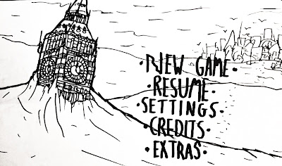
Our second task was design interfaces for our game. I made a screenshot concept and a title screen concept, as you can see below. The interface of the screenshot is quite obvious and so doesn't look too unique, but it does give a good idea of how the game will look when it's been played and so is a good starting point. The title screen shows the Big Ben, which is buried in the snow, with the city in the background. This start to the game gives quite a good impression of the game's mood and so has a strong impact. The text is just one I did quickly, so that is something I will need to consider in the future.

Title Screen Concept

Screenshot/Interface concept

Ideas 1 and 2

Ideas 3 and 4


Character: Initial Design Idea - Retinue


I have made this design of a character from the Retinue territory and it shows my initial thought behind how they'll look. I have also made an emblem for this territory as they will all their own. 

Retinue Definition: a group of advisers, assistants, or others accompanying an important person.

From the defintion, I have designed a character that resembles a Knight, the obvious reason being is that the character serves a person of importance, like a King or Queen. When designing the emblem, I looked at emblem meanings and so found the meanings of the 3 different icons in the emblem that I designed:

Key: The key is a symbol of knowledge, guardianship and dominiontwo key cross is the symbol of St. Peter, the key to the gates of heaven.

Sword: The sword is the symbol of the military honorIt is also a symbol of power and freedom. The sword (especially with flameis also a symbol of purification.

Tower: The tower is very much like a castle,  it is a emblem of grandeur and of society.It is also a symbol of the defense and an individual fortitude.

I felt that these definitions suited the territory well and so when designing my character I tried to make it suit those meanings and colours. Overall, I think it's quite a good starting point, but there are some things that need fixing, like the colours, the face and the clothing.

Bibliography:
(2015) - Heraldry Symbols and their meanings - http://www.familytreesandcrests.com/heraldry-symbols.htm - (Accessed 19/11/2015)

Tuesday 17 November 2015

Character: Wolves - Silhouettes

Below are six silhouettes of wolves that I have done, which will, like the Yetis, be a source of danger in the game. I have tried to get some of the main poses that we would expect wolves to do, which is why there are only 6. They are all quite accurate and so I am very pleased with these.

Set of Silhouettes #1

Set of Silhouettes #2

All 6 silhouettes

Character: Yeti - Silhouettes

I have made these 10 silhouettes for the Yetis that will be in the game. It was bit of a challenge trying to get a pose that could be understood in it's silhouette and so there were some that I chose to stop working with. These silhouettes are the ones that I feel work the best. Some of them are a bit irregular in places but the overall poses are reasonably accurate.

Monday 16 November 2015

Character: OGR - 16th November 2015


As I have said in the OGR, I am yet to upload some design work, but will get some uploaded in the upcoming days and as soon as possible.

Sunday 15 November 2015

Character: Game Outline

For this project, the three cards that I picked at random were Air, Resources and Urban. After speaking with Justin on several occasions, I have reached a final game idea that I will design:


Set in the post apocalyptic future of Earth, the World has been destroyed as a result of global warming. The year is 2237, but the design of the World's architecture demonstrates that it has been the same for 2 centuries. The city of London has been divided into 3 territories: Scavengers, Retinue and The Cabal. Depending on your choice, as the player of the game, you can choose which territory you wish to belong to. Based on your decision, this will decide on what your character looks like, what clothes he/she wears and how they act. Once your choice has been made, you can create your own characters, with certain limits so you match your territories style of life. Once you step into this world, your job is to help your people by improving the living conditions, so that the people can survive the World's harsh conditions (Snow, Wind storms etc.). You will have other goals in the game, such as completing tasks for other members of your territory, exploring the world for more resources that will improve the way of life for the people, and will also encounter other territories, which may or may not be against you. In your travels, you will face many creatures, such as yetis and wolves. These creatures don't discriminate and will kill you. However, due to certain mission requirements you must go into their areas in order to save members of your community. This will improve your reputation, which will in turn make you a key member of your territory.

Friday 6 November 2015

Narrative: Character Design - Frederick Caro

For our narrative project, I have been designing the Father, Frederick Caro. As you can see from the images below I have done 1 design and then done some colour experiments for that design. When doing the original drawing, I wasn't happy with the face that I drew, so I drew two more, so that I could choose between the two new faces and edit the drawing on photoshop. 

I am quite happy with this design as it summaries the character's personality well, through the expression on his face and in his pose. I then did some colour experiments - obviously to see which colours work best. I like the green shirted one the most, as it has the most realistic use of tone and colour.

Colour Experiments

Drawing in Photoshop

Original Drawing


Wednesday 4 November 2015

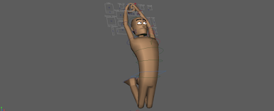
Maya: Start, Middle and Ending pose

Below are the beginning, middle and ending poses that I created in Maya. It was quite hard to do some of the middle poses, as there was either too much of a transition from the first pose to the last pose (This is the case for the Spider-Man pose) or I couldn't think of a better way to show how the poses could link together (This is the case for the Pulp Fiction pose). I think the Eden Hazard poses work best as there is a realistic movement there, although it does jump to the last pose a bit quickly, as the the first two poses are quite similar.

 Eden Hazard - Chelsea FC Footballer - Start
  Eden Hazard - Chelsea FC Footballer - Middle
 Eden Hazard - Chelsea FC Footballer - End


 Mia Wallace (Played by Uma Thurman) from Pulp Fiction (1994) - Start
  Mia Wallace (Played by Uma Thurman) from Pulp Fiction (1994) - Middle
 Mia Wallace (Played by Uma Thurman) from Pulp Fiction (1994) - End


Spider-Man - Start
 Spider-Man - Middle
Spider-Man - End


 Gianfranco Zola - Former Chelsea FC Footballer - Start
  Gianfranco Zola - Former Chelsea FC Footballer - Middle
 Gianfranco Zola - Former Chelsea FC Footballer - End


Tuesday 3 November 2015

Character Session: 03/11/2015

In today's character session with Justin we were learning about expressions in both the face and the body. Our first task was to draw a Superman pose that Charlie was doing. By trying to remember how I created the maya poses, I wanted to make sure I demonstrated the correct details of the body's position. I did the first one wrong, so I did another one, but in doing so didn't manage to finish the next pose in time. Our next task was to get into a pose, dependent on the scenario we picked, and then the other members of the group, in our case a group of 4, would draw you in your pose. As we were in an even group, we did two people at a time (Myself and Ridge - Julien and Emma), This was a very fun exercise. I tried to get the main idea of the pose in my stick men drawings and got mixed results, some work well, but some went completely wrong - whether it being due to the balance of the figure or just incorrect placements of arms, legs etc. 

Our final task was to pick a character of our choice and then create expressions for that character. I was a little confused as to whether we had to do the whole body or just the face or both. As you can see from the images below, I chose Wile E. Coyote and did a series of facial expressions for him, as well as copying a pose that I found on google. I think these all look very similar and there isn't much difference in expressions. It was difficult trying to figure out how he would look if his mouth was open, and so that is why his mouth is closed in all the expressions. When Justin came round and spoke to me, he asked me to pick an emotion and so I chose anger. He then did some quick sketches using images from google to show me how I could create an angry expression. 

Wile E. Coyote Facial Expressions

Justin's Angry expression sketches.

Stickmen poses.

Sunday 1 November 2015

Narrative: Thumbnails - Circus (Exterior)

Below are some thumbnails of the circus for our narrative project. I tried to use a lot of bright colours and make it look like a real circus, while staying having a cartoon look. The designs are quite generic, so I need to think of more ways as to how the circus can be more unique - That is something that we will discuss as a group.

Finished thumbnails.

Plain, black and white.

Original thumbnails on paper.