In today's Character session, we were learning about game interfaces. We began with the task of designing game cards/emblems for a card game, obviously, that is based around the thing that Justin gave us - I got "Dinosaurs". I'm not a card game player, so the first 3 ideas are just based around cards that I found on google, which I then changed a bit to try and match the Dinosaur theme. Once I spoke with Justin, he gave me a good game idea, which was based around evolution and upgrading your dinosaurs (Cards) and so the task is to get the best one possible by defeating other players. worked with this idea and designed a card and some emblems for it. Although the card looks like it has a pre-historic design, to some degree, the emblem logos don't match the theme too well.
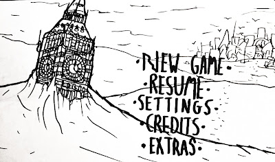
Our second task was design interfaces for our game. I made a screenshot concept and a title screen concept, as you can see below. The interface of the screenshot is quite obvious and so doesn't look too unique, but it does give a good idea of how the game will look when it's been played and so is a good starting point. The title screen shows the Big Ben, which is buried in the snow, with the city in the background. This start to the game gives quite a good impression of the game's mood and so has a strong impact. The text is just one I did quickly, so that is something I will need to consider in the future.
Title Screen Concept
Screenshot/Interface concept
Ideas 1 and 2
Ideas 3 and 4


No comments:
Post a Comment